An open-source civic platform that crowdsources sidewalk accessibility data through a labeling game
The Challenge
The platform’s UI was visually outdated, inconsistent, and fragile—making even small updates risky.
Impact
I led a complete redesign of the visual system and created a scalable design system adopted across 8+ cities. I improved dev velocity, reduced frontend bugs, and introduced WCAG-compliant components.
Team
1 designer (me)
1 PM
2 developers
Duration
12 months
Platform
Web (desktop-first, responsive design in progress)
Tools
Figma
GitHub
Hotjar
Phase
This case study reflects my personal perspective as the lead designer. It does not represent the official views of Project Sidewalk.
Due to NDA constraints, certain implementation details have been omitted or generalized.
Hover me!
Overview
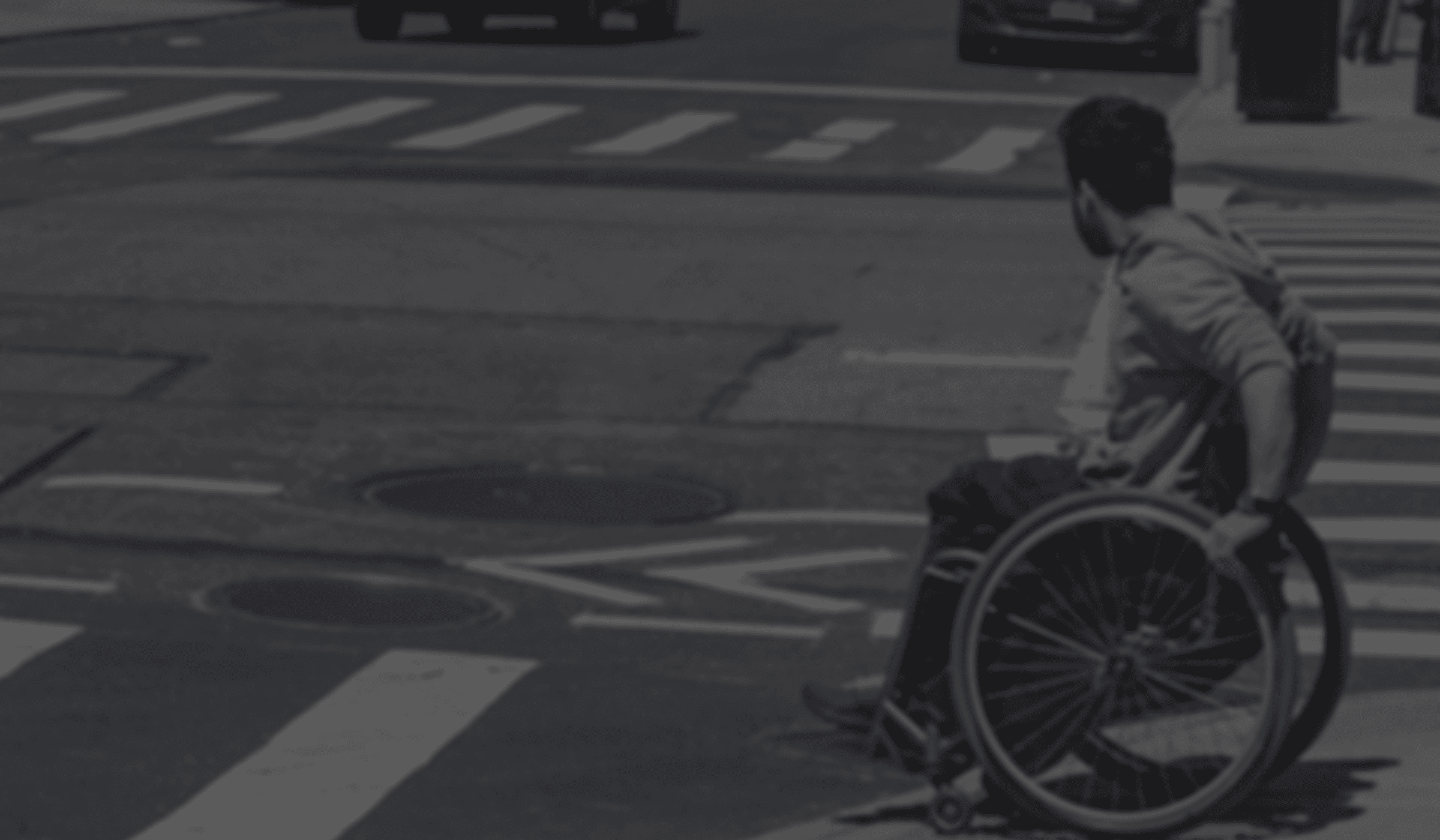
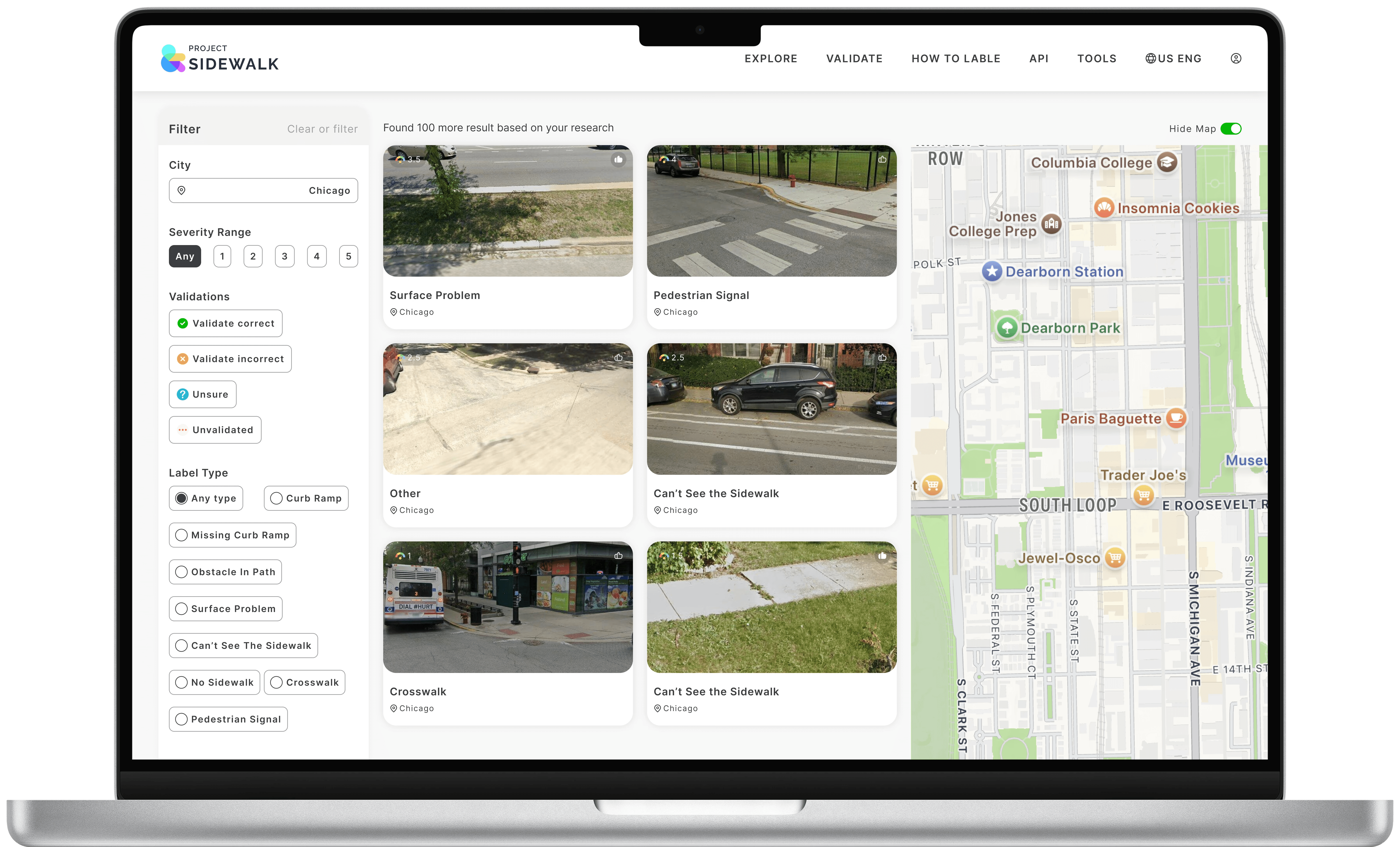
What is Project Sidewalk?
Project Sidewalk is a web-based platform where volunteers label accessibility issues in their city's sidewalks using Google Street View. These labels train machine learning models, which power tools for mapping, visualization, and city planning. The platform's goal is to help make urban environments more accessible by informing smarter routing, infrastructure repair, and inclusive design decisions.
Challenge
When I joined, the platform had over 350,000 user labels. But lacked a consistent design foundation, making even small UI changes difficult and the overall experience fragmented.
I faced three core challenges:
Challenge #1

Visual inconsistency
Responses often sounded like templated coaching tips, lacking emotional depth or relevance.
Challenge #2

Reporting flow drop-off
due to unclear structure and feedback.
Challenge #3

No design system
meaning engineers had to rebuild UI from scratch for each feature
My goal was to rebuild both the UX foundation and design system—so the platform could grow, and users could contribute with confidence.
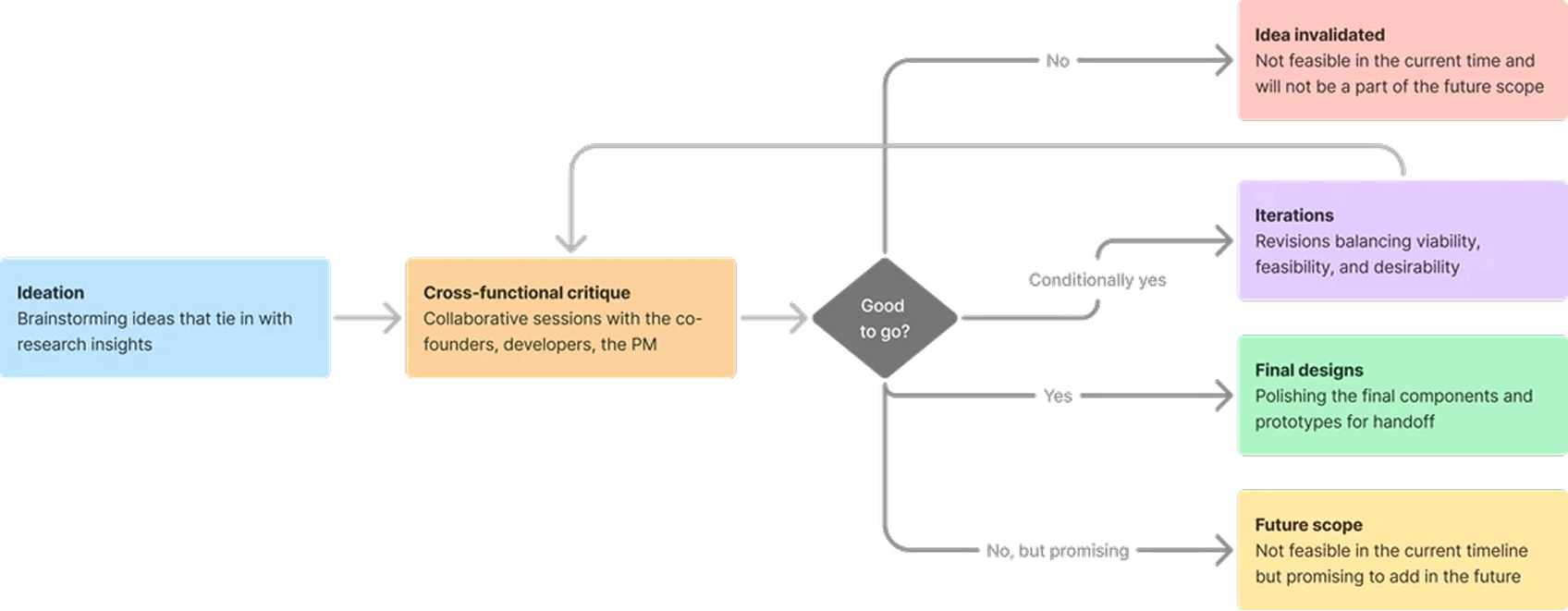
Process
A phased approach to rebuilding from the inside out
To better illustrate the evolution of this 12-month redesign, I broke down the process into four key phases—each tied to a concrete set of outcomes and design activities.
Auditing the experience to identify scalable design opportunities
Over the course of the first phase, I focused on mapping out the platform’s existing UI and user experience. This included documenting every component, interaction pattern, and behavior across flows.
Challenge #1
Visual inconsistency
Challenge #2
Reporting flow drop-off
Challenge #3
No design system
ACtion #1
I identified inconsistencies in how labels, icons, and button states were used, even within the same page.
ACtion #2
I reviewed Hotjar heatmaps and session recordings to understand where users dropped off or hesitated.
ACtion #3
I analyzed GitHub issues and user forum discussions to prioritize recurring usability pain points.
This initial groundwork shaped how I defined the design tokens, restructured layout logic, and prioritized areas for modular rebuilding. It also aligned the team on where design interventions would make the greatest impact.
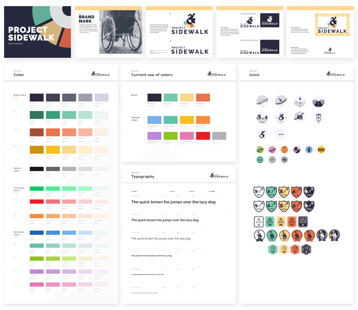
Designing a System that Could Scale and Stick
To address the platform’s fragmented interface and repetitive UI development, I focused on building a design system grounded in clarity, consistency, and developer efficiency—starting from a reusable token layer to full production integration.
1. Establishing the Foundations — Tokens
I began by defining atomic values that could drive scalable decisions across layout, type, and interaction:

Screenshot of Figma component playground
These tokens were implemented in Figma as named styles and variables, mirroring how engineers managed SCSS variables—ensuring semantic consistency across tools.
2. Building the Component Library
Each component was reconstructed using these tokens, enabling flexibility and system-wide consistency:
These tokens were implemented in Figma as named styles and variables, mirroring how engineers managed SCSS variables—ensuring semantic consistency across tools.
3. Bridging Design and Development
Each component was reconstructed using these tokens, enabling flexibility and system-wide consistency:
These tokens were implemented in Figma as named styles and variables, mirroring how engineers managed SCSS variables—ensuring semantic consistency across tools.
Outcome
What changed after we launched the system
What began as a UI cleanup evolved into a strategic effort to scale a civic tool through thoughtful, resilient design.
+
reusable components
adopted across the platform
Contributor task completion improved due to clearer, more intuitive flows
Engineering effort dropped, as designers and developers now shared a common system language
Reflection
Shifting from screens to systems
Learning #1
Mindset shift
This project changed how I think about design—from delivering polished interfaces to building systems that enable sustainable growth and empower others to contribute.
Learning #2
System thinking in real-world impact
Designing for a civic platform meant thinking beyond aesthetics. My focus was on improving participation and trust by creating tools people could rely on.
Learning #3
Designing for sustainability
Long-term maintainability required aligning design with team workflows, community goals, and a constantly evolving platform.